Responsive website design ensures to enrich your Internet surfing experience on any high-end hand-held gadget.
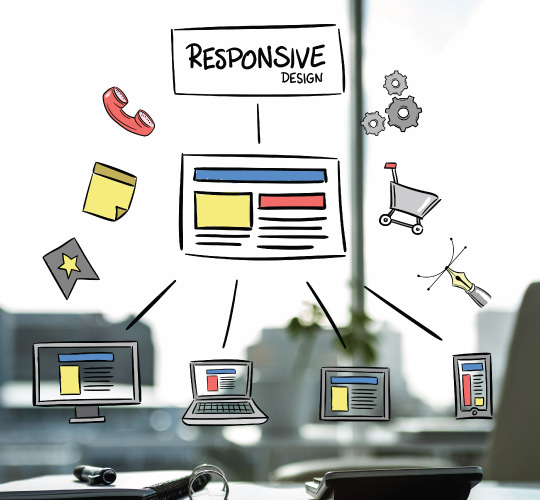
A responsive design enables a website to run on any Internet-enabled device without affecting the content framework. It means that content and functionality will adapt to each unique device used to explore your website to complete the purchase.

Customers, of late, seem to search for online outlets from anywhere, anything, and they are found to be less concerned about devices used to access them. With responsive websites by their side, they are hardly deprived of exploring optimized web-based platforms without worrying about the use of devices to access them.

Responsive design has a number of benefits as it improves ranking on search engines and keeps viewing & interaction smoother for users. With a better user experience, responsive website design is adapted to different device sizes and looks great without concerning about the device's screen size.

A responsive website directs visitors to a single site, no matter what devices they use. It helps you to alter, design & development for all devices at the same time. One need not to create different website for different devices and that is what saves a lot of time and money.

Responsive websites are considered mobile friendly and search engine friendly, and you have to mange single website for all the screen sizes of all the devices. Such responsive websites make it is easy to search and enhance the visibility in accordance with search Engine Optimization (SEO) strategy.
© Copyright 2017 intechnologiesinc.net. All Rights Reserved.